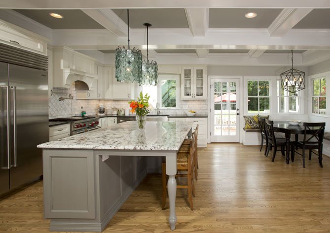
Granite bianco surfaces, marble tile wall covering, a coffered ceiling delineated in white and grey, are among the finishwork details distinguishing the plan executed by Sun Design Remodeling. Photo provided by Home Fronts News
Neighbors help each other. That's what communities have always been about. Long-time Clifton resident Bob Gallagher is rallying his friends and peers to help his neighbor Elsa Armendaris.
Armendaris, a mother of seven, needs funds to repair the badly deteriorated driveway to her home, which is also a local day care center. To help out, Gallagher, who is a principal at Sun Design Remodeling, has organized a tour of three newly remodeled Clifton homes, each the handiwork of a different remodeler.
“The homes are all pretty spectacular in their own right,” Gallagher says. “We've found that homeowners really enjoy seeing what their neighbors are doing. But this is also about helping a local person in need; that's the sense of community which Clifton has always exemplified.”
In addition to showcasing a home recently renovated by Sun Design Remodeling, the tour will feature recent work by Daniels Design and Remodeling and Kohlmark Group Architects and Builders, all active in Clifton and environs for years.
Tim Reed of Tibbs Paving will be donating the labor, equipment and trucking needed for the driveway re-paving. Armendaris has also raised several thousand dollars for the project.
ARMENDARIS' STORY IS ONE of quiet determination in pursuit of the American Dream.
A native of El Salvador, Armendaris lost her husband, David, to leukemia six years ago and, as the sole means of her family's support, decided to set up her home as a day care center.
With its tree-shaded lot and sizable living and family rooms, the house provided a perfect setting. Among other features, the two-level structure is off the main road, down a winding driveway. A safe place for kids.
Initially, the center did well. Since it was convenient to nearby Clifton Elementary, parents would leave their children with Armendaris before and after school. Many of the children at the center were friends with her own children
But when Clifton Elementary closed in 2010, the day care center lost more than half its students.
Not long after that, the winding asphalt driveway leading to the house began to seriously deteriorate.
Armendaris says that she and her children with the help of a friendly neighbor have been patching the drive for years. However, it eventually become obvious that her own fix-up efforts wouldn't be enough.
Soon she began soliciting bids from professional pavers, some of whom were simply working the neighborhood.
“I wasn't sure what I really needed, or who was reliable,” she recalls. “But what really slowed the process was the cost.”
That's when her friend, Christina Gallagher, whose children had attended the day care center, offered to ask her husband, Bob, for ideas.
“I just thought there must be a way that a community as old and close-knit as Clifton could help one of its own,” said Bob Gallagher, who grew up in Clifton where his father practiced medicine. “My company has learned a lot from doing our own home tours, so a coalition of remodelers already active in Clifton seems like a logical way to reach out to the community.”
The Tour
The tour has been conceived to provide a close-up look at how Clifton residents live today, and to profile several design trends now being applied to local homes. It also will reflect some of the community's varied demographics — which range from young families to retirees retrofitting their house to age-in-place.
Makeover in Colchester Hunt
In Clifton's Colchester Hunt section, Steve and Maureen Landry are putting the finishing touches on a forward-looking retrofit executed by Tom Flach at Kolmark Architects. The Craftsman-style architecture embraces an open floor plan which the Landrys see as perfect for a host of regular social pursuits such as book clubs and after-church gatherings.
Referring to the house as “his last home,” Steve Landry, 65, says he and his wife actually looked for a larger house “further out” before deciding that improving what they had was their best option.
“It was Tom Flach's clever ideas that were the deciding factor,” Maureen Landry said. The plan included needs for the immediate future, and also elements that might be needed to age in place over extended time.
For instance, the former 400-square-foot garage has been converted into a well-appointed master suite complete with 14-foot cathedral ceiling, a full bath and an 8-foot wall of windows focused on the garden and two-tiered pond. While the couple's initial plan is to use the new space as a reading room, Maureen Landry said that the suite is a nod to an aging-in-place strategy that calls for frequently used spaces to be on the same floor.
“We've even got ideas and costs for an elevator, should we need one,” she said.
Meanwhile, a new two car garage has been added to the home's front elevation. The eye-catching period facade incorporates “mesa red” windows, a new entrance portico articulated in cedar truss beams and French doors that open directly onto a front-facing patio,
With the former powder room absorbed into the new suite, and interior walls removed, the architect developed the new open floor plan.
The kitchen and dining zone is now formed into a 600-square-foot family kitchen that revolves around a two-tier food preparation island and dining counter. Mounted on a cherry wood base, the island is surfaced in both walnut butcher block and Vermont soapstone.
Adjacent to the kitchen/dining area, delineated by a peninsular fireplace, the 300-square-foot family room/sitting room provides ample space for an enlarged social gathering.
The 225-square-foot sunroom, now fully mainstreamed into the home's HVAC system, is a gathering spot with a panoramic view of the wooded surroundings.
Kitchen Suite in Elegant Transitional Style
Not too far away in Clifton Heights, Rick and Kelly Layfield are reveling in a new family-friendly kitchen and outlier zones custom-designed for their active daily household needs by Jon Benson, lead designer at Sun Design Remodeling.
“We have three children under age 12,” Kelly said, “so we wanted a plan that would make it easier for everyone to interact, and that also offered sightlines from the kitchen to the backyard where the kids play.”
That meant re-working a course of windows on the rear elevation, making it easier to access the outside from several directions and introducing a floor plan more conducive to free-flowing traffic.
The starting point, however, was the offending two-tiered ceiling, a reminder of the fact that the back half of the kitchen has a separate roof unconnected to the structural supports in the first half of the kitchen which are busily engaged in holding up the home's second floor.
“Structurally, the existing plan is perfectly logical,” Jon Benson said. “Aesthetically, it was a strange effect ... one that Kelly Layfield wanted to change.”
Benson proposed a coffered ceiling. The end product unifies the room visually and reintroduces the classical design elements found in the home's formal front rooms that had been curiously missing in its kitchen.
The ceiling also set the tone for a much more refined and elegant plan featuring several of Benson's original built-ins.
There is a new granite-surfaced island and dining counter. While the kitchen also formerly provided a spot for family breakfasts, Kelly Layfield said it mostly seemed space restricted.
Benson created a larger exit door in the middle-of the kitchen's rear wall, allocating expanded corner space for a L-shaped window bench which will provide built-in seating for the breakfast table as well as handy storage. There is also now a door from the family room to the screened porch.
Benson added a grilling deck next to the screened porch and just outside the new kitchen door. Rick Layfield, who is the family's grilling chef finds it a great place to interact with friends and family while pursuing a favored recipe.
Family Home on Hunting Horse Drive
Those who know their way around Hunting Horse Drive sometimes might wonder what happened to the circa-1970s Colonial style house that used to be perched up on the overlook. Clearly, the sprawling manor house there now is an entirely different home, but how did it get there?
Owner and professional remodeler Ted Daniels says the makeover was the result of an inspired plan to create an environment that would work better for himself, wife Gayle and their two children.
Purchasing the 4,400-square-foot production house in 2000, Daniels initially thought the house adequate for raising a family, and focused on the serious business of renovating other people's homes. Certainly, the five-acre wood lot had everything to offer in the way of a lovely bucolic setting.
But after living in the house for a while, Daniels developed a growing list of possible improvements, which prompted a decision to add 2,000 square feet to the rear of the house, and gut the entire first and second floors almost down to the studs.
“For starters, I didn't like the way the first floor was configured,” Daniels says. “The kitchen and family room were partitioned in a way that inhibited traffic, and the interior was really dated. I wanted a quiet first floor place where the kids could do their homework. Also, there wasn't enough storage.” He also wanted better lines-of-sight.
Upstairs, a similar dysfunction prevailed. The master bedroom was too small. The sitting room, which offered the best view, also became a kind of clutter-prone foyer between the walk-in closet and the master bath.
“It was as if we were living in someone else’s house,” Daniels said. “I wanted a plan that would really support a whole spectrum of daily family requirements.”
With substantial new square footage now extending out the rear of the existing structure, Daniels generously reconfigured floor plans on the first and second level, concentrating on how his family would use the new space.
The 396-square-foot kitchen segues easily into a rear-facing great room that features floor-to-ceiling windows flanking a central French door. The many original built-ins include a food preparation island and knee-high walnut cabinets which provide a space divider between two primary activity zones. The inside corner of the kitchen accommodates a family dining nook.
The primary focal point of the family room is a hand-carved cherry wood mantle piece Daniels bought years ago, having no idea when or where he would use it.
“It's comforting to see an impulse buy become a real focal point,” he said.
Upstairs, Daniels built a 715-square-foot master bedroom suite that opens directly to a sprawling balcony with views in three directions.
“This is the spot where we can have some privacy and still keep an eye on the kids,” Gayle Daniels said. “It's quite romantic.”
The luxury bathroom and large walk-in closet are now sensibly positioned on either side of the suite's entrance foyer. The master bath includes a soaking tub, a spacious walk-in shower and a private closet for Gayle's vanity.
The formal living room and dining room are on the right side of the first floor, segregated by a fully-wired well-appointed room the kids use for homework.
John Byrd (byrdmatx@comcast.net) has been writing about residential building and architecture for 30 years.

