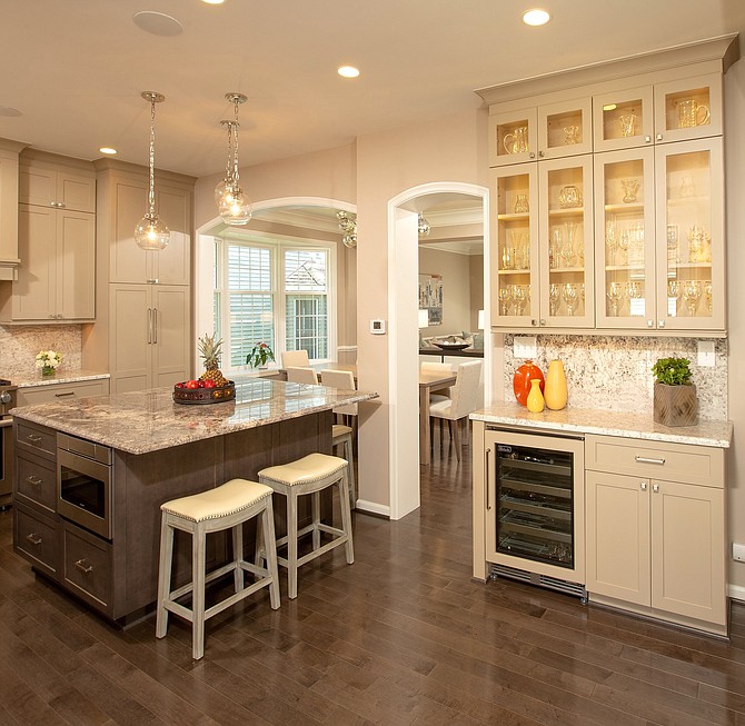
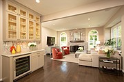
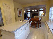
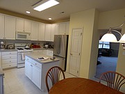
To generate more light and living space in a circa 1990s house, Sun Design Remodeling removed a wall between the kitchen and great room. A granite food prep and dining counter replaces a stand-alone breakfast table. The wine refrigerator is convenient to the re-designed family room. Photo by Greg Hadley
Sometimes the second act requires a set change. In the case of a Reston couple seeking to re-vitalize the home they had occupied for 30 years, agenda-busy lives had come to a reflective pause.
The kids were now in senior high school and college – mostly living at home. The lower-level family entertainment area, meanwhile, belonged to a bygone era. The master suite was, likewise, an anachronism.
The circa 1990s kitchen in the northwest corner of the first floor provided easy access to both an adjacent family room with fireplace, and a dining room/living room – which, nonetheless, were being used less frequently. In short: the house was ready for new beginnings, revisions more properly aligned to a dynamic family's actual needs.
“Of course, large-scale life changes don't necessarily require a whole house makeover,” Sun Design president Bob Gallagher admits. “We advocate an incremental approach focused on what is needed now, and what changes will satisfy the whole regimen of foreseeable requirements.”
On the other hand, when a homeowner is discovering an interior design style that speaks to them, “the process may build momentum,” he adds, “especially when the owners have been given the tools needed to explore ideas in depth.”
By tools, Gallagher refers to multi-faceted space-planner/lead designer Ericka Williams, and the project team at Sun Design Remodeling.
“It was an inspiring collaboration,” Gallagher allows. “The owners had attended Sun Design seminars earlier, toured several remodeled homes and talked to our past clients…so they knew what to expect. Turns out, this was just the beginning of their discovering more about their personal tastes.”
To start at the top: that summer, the owners had celebrated 23 years of residency in their two story, four bedroom production house, and were taking stock of what they wanted from the years ahead.
At just over 1,000 square feet, the home's primary level living area seemed adequate relative to living space requirements. The problem was that the original space plan and interior finishes were quite dated. Bathrooms designed in the 1990s featured oversized bathtubs, small showers and a vanity illuminated by Hollywood strip lighting. The children's playroom in the lower level had been set up for grade school activities. Walls formed to define rooms also blocked the light, and obstructed visual continuum.
The food prep island in the kitchen, meanwhile, nearly abutted a breakfast table which was, in turn, sequestered from the family room by a half wall. When entertaining was underway, the kitchen was beyond the conversational reach of both social gathering zones. Moreover, with the microwave above the cooktop and refrigerator to the right, the cook's work triangle was often in the center of traffic bottlenecks.
“There was a wall with an HVAC duct separating the kitchen from the dining room/living room,” Williams recalls. “The original Formica countertops didn't function well as a working surface for hot pots and pans.”
Elsewhere, main level carpet and tiling were becoming threadbare. While the dining room and kitchen had been originally conceived for formal entertaining, the reality was a 24 ft x 16 “great room” – mostly reserved for holidays.
“Interior lines were not well articulated,” Williams says. “The first level rooms were large enough, but the space seemed looming, almost empty.”
What was needed was an “open” plan with interactive, clearly defined activity zones.
Seizing the day, Williams proposed a custom buffet as a way to differentiate the dining zone from the living room. The piece would function as a service station and storage unit from both sides.
To better articulate the main level interior, Williams re-routed the HVAC duct work and converted the wall into a pair of arched openings crowned. Taupe-hued walls combined with a soft white trim confer a stately elegance on uncluttered sightlines.
Glass-facing cabinets, a 25-bottle wine refrigerator and a granite-topped serving station now unify the kitchen and the family room. The fireplace surround is MSI Gray Oak tile in a straight lay pattern. The new flooring is 5-inch plank gray-stained solid maple.
Upstairs, the new spa bath features a large walk-in shower with a bench seat, “cubbies” designed for personal use and hand-held shower sprays. Among the lighting enhancements: overhead LED recessed lighting and decorative sconces.
The lower level now boasts a state-of-art entertainment center and is equipped with refrigerator and wet bar.
Sun Design Remodeling frequently sponsors design and remodeling seminars as well as tours of recently remodeled homes. For more information, visit www.Sun DesignInc.com/Events or call 703-425-5588.
John Byrd (byrdmatx@gmail.com) has been writing about home improvement for 30 years.


