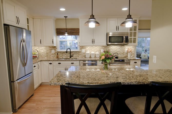
Lead designer Jon Benson removed a wall between the Borer kitchen and the dining room, adding a custom two-level food preparation surface and dining counter. The new first level floorplan "circulates beautifully," says owner Cindy Borer. Photo by Bryan Burris Photography
Sometimes life’s second act requires a bold set change. How else are others to know that the featured players have moved on, embracing new beginnings?
Reinvention is after all the quintessential triumph of creativity, and can be a very personal process when the thing reinvented is your home itself.
"Of course, large-scale life changes don’t necessarily demand a whole house makeover," recently retired teacher Cindy Borer said. But in the past year, her only son moved out to start a new career and her husband is now traveling less, so the timing was right for discoveries.
BUT TO START AT THE TOP: last spring the Borers had celebrated 20 years residency in their two-story, four-bedroom Colonial-style house in Burke, and were taking stock of what they wanted from the years ahead.
At just over 800 square feet, the home’s primary living area had been serviceable enough; even so, the formal dining room and adjacent den on opposite sides of the front facing foyer were hardly ever used and the rear family room was dark and cramped.
Evaluating options, Borer considered enlarging a few rear rooms. She also wondered if some of the home’s interior walls could be modified in way that would allow for more natural light. What to do?
It was at this juncture that Craig Durosko, founder of Sun Design Remodeling, was called-in to discuss possible space improvement scenarios.
Durosko pointed out that the couple didn’t so much lack square footage as a sensible space plan tailored to how they actually use their home. The existing "center-hall" configuration defined rooms were consistent with tradition, yet were functionally underutilized most of the time. This accounted for daily traffic patterns that didn’t work as well as they might, and a nagging sense that the entire first floor was space-restricted.
On a second subject: the mid-house floor-to-ceiling bearing wall dividing the front and rear sections of the house could be completely deleted by installing concealed vertical supports at strategic intervals, Durokso said. Such a move would dramatically increase natural light, creating the floor space needed for an alternative layout more appropriate for both daily use and entertainment.
"On the first visit Craig pretty much solved our space plan problem," Borer said. "From this point on, I was mainly to think about the interior design details."
So Borer’s meeting with Jon Benson, the makeover’s lead designer, proved a revelation from the start. A veteran home remodeling specialist as well as a nationally recognized furniture designer, Benson’s input shaped a floor plan focused on personal requirements in which custom built-ins eliminate unneeded walls while sharply improving both room function and interior design integrity.
To create a more functional relationship between the kitchen and the dining room, for instance, the designer replaced an interior pantry with a 27.5-square-foot food preparation surface and dining counter that serves both rooms equally.
By borrowing a mere nine square feet from the dining room, Benson also found space for a small mudroom with bench immediately to the right of the side entrance to the kitchen.
Re-situating the front hall closet to the right of the front door not only widened the front foyer but also created dramatic front-to-back sight lines that make the entire house seem much larger.
Measured in square feet, the changes are small. Yet such revisions liberate the first level circulation plan, re-organizing the home’s primary living area into rooms that are both interactive and articulated.
To visually differentiate the front-facing library from the family room, the designer converted existing overhead beams into an elegant tray ceiling supported by Craftsman-style piers.
A floor-to-ceiling bookcase—also a Benson original—provides an elegant yet useful wall for the new reading room. The new family room fireplace hearth was custom-designed to accommodate the plasma TV screen that now hangs above it.
Additional interior design decisions emerged from Borer’s collaboration with Sun Design’s Jessica Page.
"Jessica helped me discover the design style I’d been looking for," Borer said. "She opened up a lot of resources. Ideas that I liked were added to a project scrapbook which we both referenced regularly to keep the decision process on track."
As space plan modifications proceeded, Borer’s research revealed a strong personal attraction to transitional-style interior design, a contemporary concept that seeks to reconcile traditional architecture with the spatial freedom of an open floor plan.
On this score, Benson’s original floorplan sketch anticipated the use of loveseats as space dividers between the family room and the den. Meanwhile, Borer’s preference for soft white and grey duotones inspired an interior paint scheme that combines sharp white and khaki.
In the kitchen, Giallo Sioriato granite surfaces are set off by a vividly original glass tile and stone backsplash which lends an invigorating streak of color to the broader visual panorama.
"Its very comfortable balance of traditional and open really works well for us," Borer said. "I found the whole process really enlightening."
