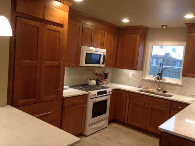
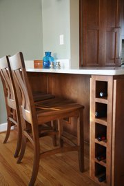
Designer Sherry Wohn removed a bearing wall between the bungalow's kitchen and the dining room, replacing it with a two-seat dining counter surfaced in an off-white quartz composite that also doubles as a serving station. Maple wood Shaker-style cabinet facings give the kitchen — which can now be seen from the living room — a relaxed, cohesive look. Photo Contributed
Coming across an 80-year-old bungalow in an otherwise up-and-coming neighborhood, today's buyer may get excited about the possibilities, but will probably end up walking away.
As everyone knows, revitalizing an older house can be a tricky business. You've got to know how to appraise; how to “guesstimate” probable costs with reasonable accuracy.
Above all, you've got to have a vision of how the improved product will look and function, and why your changes will likely recover upgrade expenses in a foreseeable future.
In other words, this is not a game for the uninformed.
Melanie Domres, by contrast, came to her recent purchase of a 2,500-square-foot, circa 1930s home in Arlington's Bluemont neighborhood with both eyes open. An MBA who has worked in real estate development for decades, Domres knows the business intimately. Moreover, she was living in a home less than two miles from the Bluemont cottage when she learned it was for sale
“It's at the end of a cul de sac. The period charm appealed to me,” she said. “Plus, the asking price was … promising.”
Inside, Domres saw a floorplan that was impressively open except for a tiny galley kitchen sequestered behind a thick bearing wall. Also, she found it easy to picture how the space could be used for her purposes, and when the owners accepted her below-appraisal bid she was pleased.
But then nagging questions: What resources will I need to proceed with a makeover? Can I do it cost-effectively — and in a way in which costs contribute directly to the home's present value.
It was while pondering all this that Domres met Sherry Wohn.
A PRINCIPAL DESIGNER at Abbey Design Center in Sterling, Wohn's 25 years of architectural drafting experience combined with a fine arts background made her a quick study. From the beginning, Domres thought she had found someone who understood her own aesthetic sensibilities.
“We started with the cabinets, and just kept going,” Domres said. “Since the plan was to eliminate the wall between the kitchen and the dining room, I wanted a completely different look for the kitchen — one well-integrated with the home's existing style elements.”
That simple requirement inspired Wohn to propose “edged” Shaker-style cabinet facings, a design detail that initiated a selective rehabilitation of the first level.
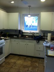
“The kitchen was largely defined by the original 80-year-old cabinets, which were covered in white paint and too small for practical use,” Wohn said. “Since it would be highly visible from the front door once the dining room wall was deleted, we wanted to really reduce the visual noise.”
Naturally, a more functional plan — with a lot more storage — was also a top goal.
The “art” of an open plan, as Wohn sees it, is partly a matter of implementing an appropriate “transitional”style:
“It's a transition from an era of hidden kitchens to one in which the kitchen is thoughtfully integrated with other activity zones within a spatial continuum,” she said. “The Shaker cabinet facings, for example, reinforce already established themes. The original wood flooring, the period hearth, the divided light windows are all of a piece.”
With that in mind, Wohn proposed accentuating the bungalow's Craftsman-style simplicity.
Part of this entailed establishing a logical segue between the kitchen and the dining room, one that makes functional sense but is also stylistically cohesive.
“A counter surface is obviously a practical solution,” Wohn said. “The trick was finding a size and a design that suits, then specifying materials that enhance the whole.”
To create a textural and color contrast to the wood cabinet facings, Domres selected an off-white quartz composite, which is as hard as granite and rapidly becoming a popular alternative. Asserting the counter's identity as “furniture,” Wohn designed a simple maple wood base that includes a flanking pair of six-bottle wine racks which serve as vertical supports.
When entertaining, the new surface works as a serving station and side board. Domres also found a pair of Amish wooden chairs that coordinated with her dining room furniture.
Since the counter fits neatly into a corner near a door leading to the sun porch, it's also convenient serving station for al fresco entertaining. Most of the time, though, it's the spot where Domres can have a coffee, check email and enjoy the morning light.
ONE OF THE PROJECT’S more challenging “built” solutions was finding a way to restrain the presence of a new 82-inch floor-to-ceiling refrigerator. Working closely with the installation team, Wohn developed maple facings for the refrigerator's three compartments that blend with the kitchen's other cabinets. While blending unobtrusively into the background, the new cabinets also increased kitchen storage capacity by 40 percent.
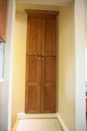
Reviewing Domres cooking requirements, Wohn designed several cabinets with roll-out trays, a lazy susan and pull-out spice racks. A former closet in the foyer to the basement was converted into a sizable pantry.
Details
Abbey Design Center offers workshops on home remodeling topics. Call 703-450-8181 or visit http://www.abbeydes…">www.abbeydesigncent….
Other kitchen finishwork elements are similarly understated. The matte finish ceramic flooring sets a restful tone. There are under-cabinet LED lights at key locations. Still more notable is the stone and glass backsplash which Domres chose in her visit to the Abbey showroom.
“It has a kind of timeless quality. It's not splashy, yet makes a statement,” said Domres. “I get a lot of compliments on it from friends.”
Domres said she made most of her finishwork decisions at the Abbey showroom: “There were lots of useful choices, and everyone was very organized. It was a very smooth process. The makeover now feels very much like my home.”


